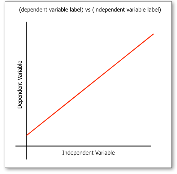
When drawing a graph on a piece of graph paper, the graph should take up at least 2/3's of the graph space. That means the actual line/curve that is drawn should take up 2/3's of the sheet of paper.
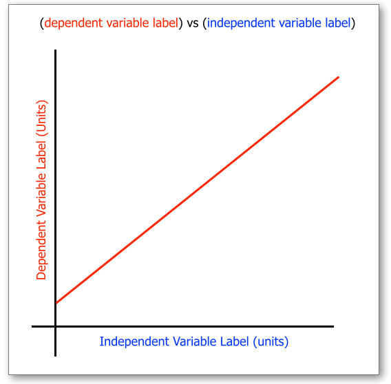
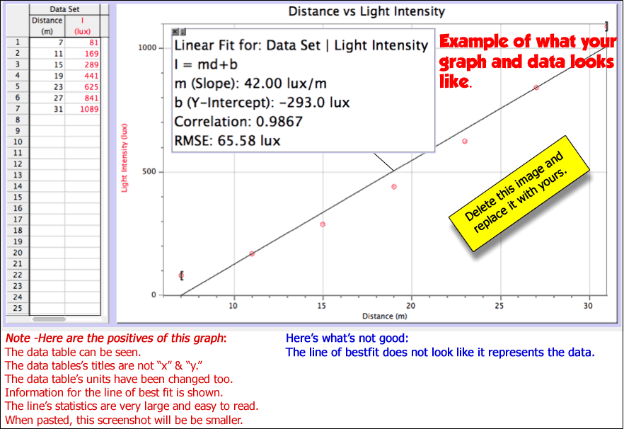
If you are taking a "screen shot" of a graph make it the full width and make the font as large as possible. Having said that, if you are using "Logger Pro," you cannot adjust the size of the font on the axes. You can only adjust the size of the font in the dialog boxes that report statistics.
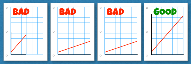 |
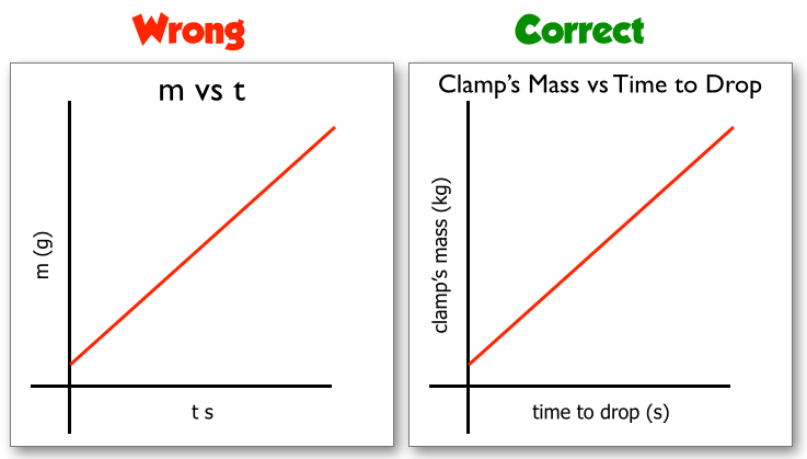
| This graph does not take up at least 2/3's of the graph space. |
This graph does not take up at least 2/3's of the graph space. |
The grid takes up 2/3's of the graph space but the line does not. |
This take up more than 2/3's of the graph space. It's a good graph. |
|