Labs
Page 6
next


This text is meant to accompany class discussions. It is not everything there is to know about uniform circular motion. It is meant as a  prep for class.

Click for the questions that go with this reading
How to Make an Equation from a Graph


Graph Types

One of the ways cause and effect is better understood is by modeling the behavior with a math equation. To generate a math equation from a collection of data, we will use a process called "linearizing data."

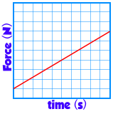
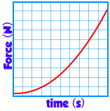
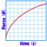
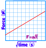
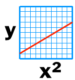
In this physics course there are three types of graphs that our labs data will generate. They are

Curve types by shape

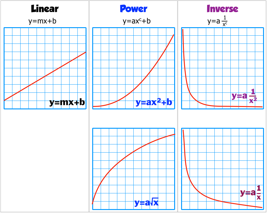
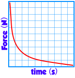
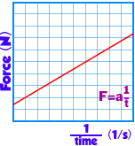
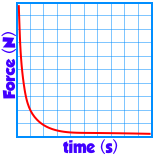
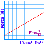
You need to recognize the graph types by their appearance. Unfortunately, the inverse graphs look similar. The inverse squared form has a curve that bends closer to the origin. Only by linearizing the data would you know that the function is either 1/x or 1/x2.


Line of Best Fit or "Trend line"

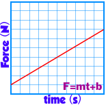
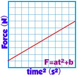
There are a few ways to determine line that best represents a collections of data. We use the least squares method. Below is a collection of data points and the line of best fit.

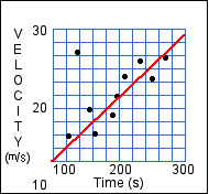
The line of best fit provides a math model to make predictions about data points not on the graph and to evaluate the math model's precision. This math model yields an equation for a straight line in the form of "y = mx + b." Most programs interpret the data to give you the value for the slope and intercept.

The trendline function is Google Sheets can give you the slope and y-intercept.

There are two ways to evaluate if the y=mx+b that is derived from the line of best fit is close to representing the data.

1 The software calculates a value called the Regression coefficient, "R." The closer the absolute value of "R" is to 1, the better the fit of the trendline.
2 Use your brain and look at the data points. The line of best fit should closely follow about 70% or more the data points.
From the math expression y = mx + b to the "science" equation

This 94 second video explains how to go from y = mx + b to an equation with the variables we use in science.

This video can be found on YouTube at http://youtu.be/Mgarwbwv2zI

 
Describing math relationships with language


Below are examples of what the language looks like for each relationship. It generally fits this form,

(Vertical axis) is (type of proportionality) to the (horizontal axis.)

What the graph of raw data looks like
What the linearized data looks like & its equation.
Description in words
Linear
Force is directly proportional to the time.
Power
Force is proportional to time squared.
Inverse
Force is proportional to the inverse of time.
Inverse squared
Force is proportional to the inverse square of time.
Squareroot
Force is proportional to the squareroot of time


Putting it all together to Linearize the data


1 Plot the data with the independent variable on the x-axis and the dependent variable in the y-axis.
2 Identify the probable type of graph from the 5 we generally find in the this course.
3

After identifying the graph, perform that function on the x-axis and plot these new values on a new graph. (For example: Suppose the identified function is x2. Then you would square each of the x-axis values and plot a new graph of y vs x2.

4 Calculate the line of best fit for this new data.
5 Make sure the the line of best fit is "good." By examining the RMSE and the curve and data points. This is referred to as the "R" value. The closer to one it is the better.
6 Replace the "x" and "y" in the y=mx+b line of best fit equation with the accepted variables from the axises. From the example above, y = mx+b becomes y=mx2 + b because the date on the x-axis was squared.

We will be using Google Sheets to analyze data. See a short video below to see how to do some basic data manipulation in Sheets.

This video can be found on YouTube at https://youtu.be/5k5iNEjGnR.

Below is another video showing how to use Google's Sheets to Linearize data by finding the trendline. (This can be done in Excel but we use Google sheets because of its collaboration abilities.)

This video can be found on YouTube at https://youtu.be/qUQ5ApPQ3lU

You can also click here to see written instructions on how to get a "trendline" in "Google Sheets." (It will open in a new page.)

Click here to see a video example of how to do it using LoggerPro 3.8x. (AHS is currently not using LoggerPro for analysis.)


Sometimes when you insert a chart in Google Spreadsheets, you will not be able to create a trendline because you have 2 sets of data points on your screen instead of 1. This video will show you how to quickly fix that problem.


This video can be found on YouTube at https://youtu.be/YBH7NvKci8I


Quiz


by Tony Wayne ...(If you are a teacher, please feel free to use these resources in your teaching.)

The owner of this website does not collect cookies when the site is visited. However, this site uses and or embeds Adobe, Apple, GoDaddy, Google, and YouTube products. These companies collect cookies when their producs are used on my pages. Click here to go to them to find out more about how they use their cookies. If you do not agree with any of their policies then leave this site now.